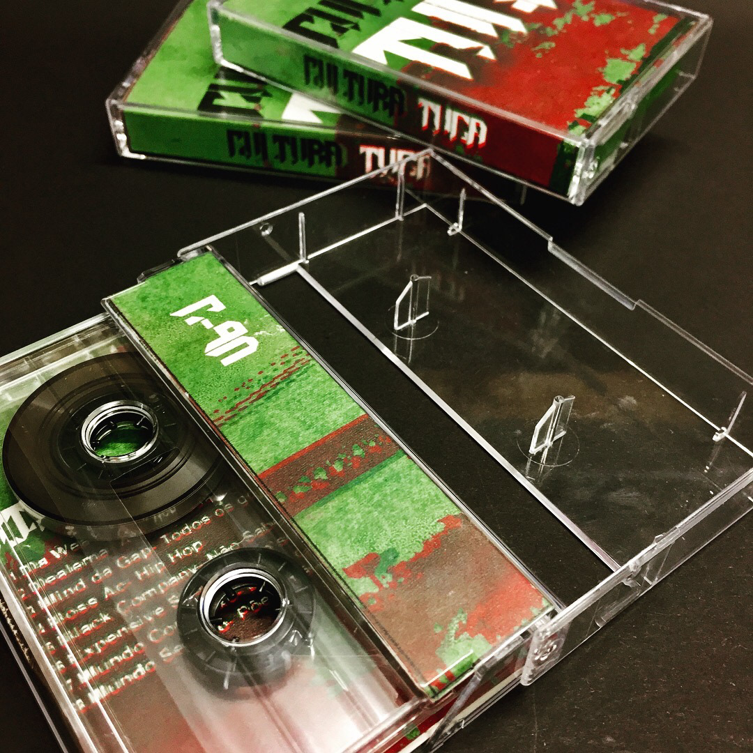
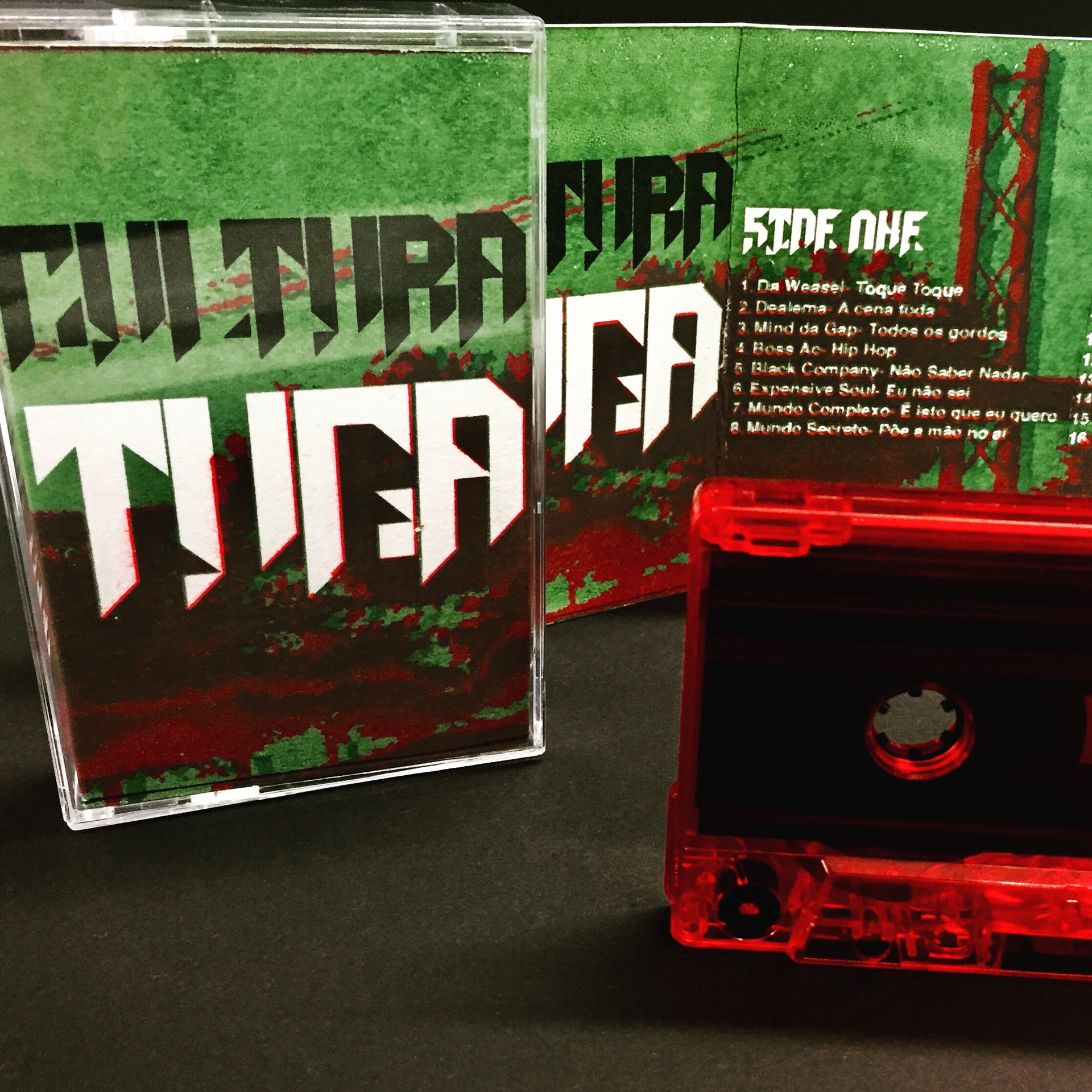
The Hop Tuga project is a vibrant exploration of a distinct micro-genre that emerged from Portugal in the 1980s. "Tuga" serves as a colloquial term for "Portuguese," and the genre itself, influenced by a rich tapestry of African music, reggae, zouk, and fado, carries a unique cultural imprint. The founding rapper, Mozambican by origin, drew heavily from his roots, and this cultural fusion serves as the cornerstone for the visual narrative of the Hop Tuga project.


The tactile dimension of the project is heightened through the use of screen-printed J-Cards. This hands-on printing technique adds an authentic touch, mirroring the artisanal and grassroots nature of the genre. The screen printing process infuses a raw and organic quality into the album art, aligning with the cultural authenticity at the core of Hop Tuga.
The typeface I created for the J-Card design was influenced by street culture and the hip-hop scene.
Central to the project is the creation of the "Cultura Tuga" typeface—a bespoke font inspired by Mozambican patterns and azulejos, the iconic Portuguese tiles. The typeface not only pays homage to the genre's roots but also incorporates decorative patterns within the letters. These patterns serve as a visual narrative, representing the early history and cultural influences that shaped the emergence of Hop Tuga.
A distinctive shade of blue is used in the Cultura Tuga typeface, echoing the hues of azulejos—Portuguese tiles known for narrating stories about the history and culture of Portugal. This specific blue becomes a visual signature, symbolizing the storytelling aspect of Hop Tuga. The colour not only pays homage to a crucial part of Portuguese culture but also infuses the branding with a sense of history and tradition.
Hop Tuga Album Art and Typeface is a testament to the power of cultural fusion in the world of music and design. By weaving together African rhythms, reggae vibes, and Portuguese storytelling traditions, this project celebrates the richness and complexity of Hop Tuga. Cultura Tuga Typeface stands as a visual ode to the genre's roots, inviting the audience to experience the music not just through their ears but also through the vibrant tapestry of cultural design.
